Wednesday 18 December 2013

MUSIC MOOD BOARD


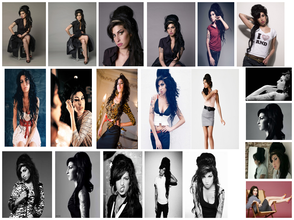
My mood board contains different images of all the things that I can relate to my magazine and my target audience.
I have included artists such as Paramore, Darwin Deez, Lana Del Rey, Arctic Monkeys and Mumford and Sons. All of which play genres of music ( alternative / indie rock )  I wish to include in my magazine and they will be artists my audience listen to.
I have chosen to feature clothing such as Dr Martens and a leather jacket because my target audience should associate themselves with that kind of fashion  and will wear similar things. In addition to this, I have given the Topshop / Topman logo. This is because my audience can buy these style of clothes from these shops. In addition the artists I have chosen to feature wear similar clothes i.e the leather jacket. And by the artists wearing them, it should inspire my audience to wear them as-well.
I have featured products that my target audience will aspire to have, such as i-pods, i-phones, vinyl records.
I've inserted pictures of the Reading line up, and pictures of festivals. This is because my audience may have been or aspire to go to the festival itself.
Also I will use the Reading line-up as an advertisement in my magazine because the artists featured will appeal to my audience. And also I can review the artists featured.
I have featured the 'NME' and the 'BBC Radio 4' logo. This is because they both have alternative music featured, and that is what I want to offer in my audience.


Tuesday 3 December 2013

MUSIC MAGAZINE IDEAS. WITH PHOTO PLANNING

1)

2)

3)


In image 1) I have given examples of what I would want my front cover image to look like. And also what artists I would like to feature. They vary in colour, size, angle, and shots. The pictures show a good example of how I can try different styles, and experiment with how many people I have in the shot.

2) Is what I want my pictures to look like. I have based it off an " Amy Winehouse" photo-shoot, because she has a variety of different poses, facial expressions and positions.

3) are ideas of what I want my double page images to look like. They are primarily pictures of groups of people. So that gives me the idea that I could have my double page image as a group photo. It has also inspire me to add some affects to the image as-well. 


Monday 18 November 2013

Representations for my MUSIC MAGAZINE.

REPRESENTATION ISSUES TO CONSIDER

•As you develop your research and ideas you will need to consider the representations exist within existing products and the representations that you will construct in your own products:

Representation in the media is concerned with how individual and groups of people, events and ideas are presented to audiences. What we see, hear and read in the media is a re-presentation of a subject it is not a real version of events it is constructed. Even a live broadcast is a representation, because you only see what is filmed by the camera operator. As a media studies student, it is important that you are able to identify and understand these representations in the products and texts that you analyse and that you construct.

•You must show evidence of considering these representations in your own work and using them to construct your products and texts if you are to reach the higher grades.

_____________________________________________________________________________

For my music magazine:

I will be constructing representations for gender, age, race and genre. 
I will represent both men, women and different races however, I will try to make my magazine gender neutral, because the majority of the bands in the genre alternative rock are predominantly white and male. 


In the genre alternative rock women and men are represented as quite punk and non mainstream. Both men and women are equal when clothing is represented, for example by wearing  non conventional clothing such as leather jackets and trousers,and what mainstream stylists would class as ''miss-matching'' top and bottoms with non conventional hair stylings, such as a ''bowl hair cut''. In addition to this the artists are quite young between the ages of 16-30.


This will mean I will not for example be presenting old men over the age of 75, who look frail and weak dressed in a suit and tie, because there are no bands with old men who are over the age of 75 with good manners and braces.  I will have to represent females and males, of a younger  aging with an alternative fashion sense. However I will have to present artists over 30 because there are popular groups / artists of that age group.

Age is represented in different ways in the music industry. For example the 16-30's are seen as young, fresh and popular, where-as the older generation are seen to have more experience, even more so if they have had a longer career so are usually respected more. 

Religion isn't represented at all in alternative rock, possibly due to the artists either not having religious beliefs or not wanting to sing about their religion. And if they wanted to sing about their religion, they wouldn't be an alternative rock group / artist.

Due to this I won't be representing any specific religion. 

The artists I will represent will predominantly be young ( between the ages of 16-30 ) due to the fact that all the artists that are popular at the moment are in that age group. Because they are young I will represent them as fresh and energetic. I will make them appeal to my audience by the use of clothing and the genre of music the artists will play.

>Bastille
>The Killers
>The 1975
>Imagine Dragons
>The Lumineers
>Fall Out Boy
>Artic Monkeys
>London Grammar
>Red Hot Chilli Peppers
>Coldplay
>Lana Del Rey
>Kings Of Leon
>Of Monsters & Men
>Kodaline
>Mumford & Sons
>Bombay Bicyle Club
>MGMT
>Arcade Fire
>Muse
>Paramore
>Foster The People
>Florence & The Machine
>30 Seconds To Mars
>AWOLNATION
>Busted
>You Me At Six
>Oasis
>The Beatles
>David Bowie
>Queen
>Nirvana
>The XX

All of these artists feature in the recent Alternative / Rock charts. I will take the representations from these artists and incorporate them into my magazine. They are all seen as 'punk' or 'indie', with a different fashion sense. My audience who will be aged between 16-25 will like artists such as the ones listed above
___________________________________________________________________

I have chosen to my music magazines genre to be alternative rock / pop. This is because the majority of music I listen to is within this genre. I enjoy listening to the music and I'm familiar with the genre and know I could produce a music magazine based on the genres. My audience will niche audience, but there is a large following of alternative rock music.


I have chosen my audience to be between 16-25 because the genre 'alternative rock' won't appeal to younger children at the ages of 7 for example, due to the fact that conventionally children of that age prefer music that is quite up-beat and pop-sounding, where-as alternative rock can sometimes be the opposite

My magazine will focus on up-coming and present artists, with popular artists from the 1990's for example.

My selected audience shop in shops like Urban Outfitter, Cow, Top Shop and River Island. They will wear things like Skinny Jeans, Converses, Shirts over T-shirts, Over-Sized Jumpers, Band T-shirts, Denim / Leather Jackets, Shorts etc...
I will advertise the shops / clothing they tend to wear, to make it more appealing to my audience. Also I will advertise new technology such as latest phone models.  

My audience will be people who spend their time going to concerts, listening to music, and spending time with their friends, therefore able to discuss what they've heard or read

Rolling Stone Brand Identity.

Rolling Stone holds a different Brand Identity to NME. This is because it features a very heavy variety of artists, but not only music artists, but actors as-well.
It features music genres such as 
Pop with Katy Perry, Lady GaGa and Taylor Swift, Hip-Hop / Rap with Jay-Z & Eminem and Rock with Jimi Hendrix.
It then shows actors such as: Johnny Depp, Kristen Stewart and Brad Pitt.
 This shows that it's not just a music based magazine. Rolling Stone does this because whoever is ''popular'' at the time or is being newly recognised  will be on the cover; for example President Obama is featured on the cover because he had just been elected President of the United State.
 Due to this it's clear that Rolling Stone values people of importance and like to promote people / artists that have achieved a new level of success and will support them in their new found fame.


The Rolling Stone masthead has changed, from Serif red bold font with a black border, and a drop shadow, to a Serif bold green font, to a blue serif bold font.
Even though they have changed the colour of their masthead, you can still recognise it as Rolling Stone because it still has the same serif font, bold-ness and drop shadow.
If you are a regular buyer of the Rolling Stone magazine, you will be able to differentiate between the publication date of the magazine issue due to the change of the masthead. 
The layout of the magazine has been consistent throughout the years Rolling Stone has been published. This is with the central image of the artist or person of significance with the text in columns both on the left or right of the image.  
This helps create Rolling Stone's Brand Identity.This is because when someone sees the themed Red and Black, masthead and the specific layout, they will know or relate those things to the Rolling Stone magazine. 
The text is always ''superimposed'' around the image.The images are always either a head shot or a mid-shot of a single person or a mid-shot or a full length shot of a group.


PREZI NME ANALYSIS

Wednesday 13 November 2013

MUSIC MAGAZINE - Second Draft of MASTHEADS.

This is the first draft of my Music Magazine Mastheads. They all (apart from one ) consist of one short word, which is what conventional mastheads consist of. They have a range of different sized letters, and fonts. From here I will add a variety of colour and decide which Masthead title and style I think fits the genre of my magazine best. In addition in my next questionnaire I will add  a few samples of my mastheads so my audience can decide which ones they like best, therefore incorporating my audience's in-put. Since my original ideas I have gotten rid of quite a few. This is because I felt that the words didn't fit with the genre I wanted my magazine.

Final CONTENTS PAGE SCHOOL MAGAZINE.

This is my final contents page with it's pictures.
I have included all the conventions needed for a contents page; Such as a:

 titleIssue NumberColumns which creates a structured layoutPage Numbers (Without the 'P' or 'No.' next to it.) I have kept the font consistent so it matches my house style of Red, White and Black. I will have two images in the right hand corner which will relate to some of my articles. I have information about what will feature in my magazine. Also I have used a variety of font sizes to differentiate between what is most important for example my Headline ''Free Pretzels'' is bigger than the information underneath.

Monday 11 November 2013

SCHOOL MAGAZINE - Content page

 This is my final contents page without the pictures. I have included all the conventions needed for a contents page; Such as a:
 title, Issue Number, Columns which creates a structured layout, Page Numbers (Without the 'P' or 'No.' next to it.) I have kept the font consistent so it matches my house style of Red, White and Black. I will have two images in the right hand corner which will relate to some of my articles. I have information about what will feature in my magazine. Also I have used a variety of font sizes to differentiate between what is most important for example my Headline ''Free Pretzels'' is bigger than the information underneath.

Final Questionnaire.

1) What age are you?

10-14 [ ]
15-24 [ ]
25-34 [ ]
35+ [ ]
2) Are you male or female

Male [ ]
Female [ ]

3) What part of the jicnar scale are you in?
( The Jicnar Scale consists of Group A (Professionals)

Upper middle class, e.g. Barristers, Doctors, Executives

Group B (Managerial)
Middle class, e.g. Bank Managers, Teachers

Group C1 (Non-Manual)
Lower middle class, white collar workers, e.g. Office Workers
____________________________________________________________

Group C2 (Manual)
Skilled working class, Blue collar workers, e.g. Car Mechanic, Machine operators, Construction workers

Group D (Partly Skilled)
Semi or unskilled manual workers, e.g. Assembly line worker

Group E (Unskilled)
Casual workers, dependent on state benefits, students ) 

Which category do you fall in?

ABC1 [ ]
C2DE [ ]

4) What draws you to a music magazine?

Name / Brand of magazine [ ]
Photos [ ]
The artists featured [ ]
The genre ( of the magazine ) [ ]
The headlines [ ]Other [ ]

5) Would you prefer a music magazine to have short or long articles?

Short [ ]
Long [ ]Both [ ]

6) Would you read a music magazine about new and upcoming artists?

Yes [ ]
No [ ]

7) Do you read any of the following music magazines?

Q [ ]
NME [ ]
Kerrang [ ]
Vibe [ ]
Uncut [ ]
None [ ]


8) How often do you read / buy music magazines?

Weekly [ ]
Fortnightly [ ]
Monthly [ ]
2-6 months [ ]
Yearly [ ]
Never [ ]

9) What do you expect from a music magazine?

New music [ ]
Music / Artist news [ ]
Reviews / Interviews [ ]
Upcoming tours / Concerts [ ]
Letters from readers [ ]All of the above [ ]
None [ ]

10)What artists do you listen to out of this list? ( You can tick more than one )


Bastille [ ]
The Killers [ ]
The 1975 [ ]
Imagine Dragons [ ]
The Lumineers [ ]
Fall Out Boy [ ]
Artic Monkeys [ ]
London Grammar [ ]
Red Hot Chilli Peppers [ ]
Coldplay [ ]
Lana Del Rey [ ]
Kings Of Leon [ ]
Of Monsters & Men [ ]
Kodaline [ ]
Mumford & Sons [ ]
Bombay Bicyle Club [ ]
MGMT [ ]
Arcade Fire [ ]
Muse [ ]
Paramore [ ]
Foster The People [ ]
Florence & The Machine [ ]
Oasis [ ]
The Beatles [ ]
David Bowie [ ] 

Queen [ ]
The XX [ ]
Other [ ] (Please specify ___________________________________________________)
None [ ]


11) How much would you spend on a music magazine?

£1 [ ]
£1.50- £2 [ ]
£2.50 - £3 [ ]
£3.50 - £4 [ ]
£4.50+ [ ]
Other [ ] ( Please specify ________ )
None [ ]


12) Which content page do you prefer?
A [ ]
B [ ]


13) Which name do you like the most: (Tick one )
Elusive [ ]
Basic Space [ ]
Radar [ ]
Reload [ ]
None [ ]

Names For MUSIC MAGAZINE.

>American
>Anthem
>Basic Space
> Electric Feel
>Elusive
>God& Monsters
>Little Talk
>Now
>Part II
>Proof
>Radar Detector
>Radioactive
>Reflektor
>Reload
>Runaways


These are some title ideas for my music magazine. They are all simple 1 or 2 words, because Mastheads are short and simple. They are all music related, or the name of a song from an artist.

Thursday 7 November 2013

What I have learned in my Preliminary Activity?


In the Preliminary Activity I learnt about Media Communication, Institution, Text and Form.In addition I have learnt about genre, connotation and denotation. I have learnt about representation and audience - with audience I have learnt about Primary and Secondary and how to decide on my target audience.With audience I have had to consider their age, what part of the Jicnar Scale they belong, either ABC1 C2DE, whether they're male or female, music tastes, background and hobbies. I've also learnt the key conventions of a  magazine front covers, contents pages.

These include:

Masthead: The name of the magazine, always positioned to the left hand side of the magazine ( Because thats where we look first. )
Headlines: The second largest text on the page, which tells you about the main article of the issue of the magazine. 
Coverlines: The text which talks about the content of the magazine. It's also smaller than the headline.
Pull Quotes: A quote that has been taken from a magazine article.
Features/Articles: Pictures, Information featured in the magazine articles. 
Lure: Something on the front cover to entice the audience / make them want to read the magazine and find out more.
Serif / Sans Serif font: Serif - Words with hooks, feet and brackets. Sans Serif - Words without.
Pug: A shape with text written in it to grab the audiences attention.
Layout: Structure of the magazine.
House Style: Colours, themes, text, that make the magazine.
Mode of Address: The way the magazine speaks to its audience. 
Visual Syntax: The way the readers eye follows the layout of the magazine.
Straplines: Smaller font headline below the main headline.
Banner: Coloured banner with text on it.
Photots: Images used.
Masking: Cutting around the photo to make it blend into the background.
Stand first: An introductory paragraph before the main article.
Drop-shadow: Shadowing around a text to make it stand out.
Cropping: cutting off parts of an image to emphasize a particular thing.
Graphics:the use of design for words and images.

Contents page:
Issue no. / Dates: the date that the magazine is published and the issue number.
Categories/ sections: categorizing the features of the magazine.
Columns:organizing the text in columns.
Caption: a small description of the image that the caption is directly below. 
Pictures: images related to the articles.
Structured layout: making the magazine structured and easier to read.Pull quotes: quotes taken from the articles.
Title (contents): large text to show that this is the contents page of the magazine.
Banners:blocks of colour with text on to make the text stand out.
Headlines:the main title in a large text.
Numbers: showing the page numbers the articles are on.
Colour scheme: colours that link to the house scheme.

NME's Brand Identity

These covers all feature a range of artists and styles. For example rock with My Chemical Romance, folk with Mumford & Sons, indie pop with Florence & The Machine. This shows that NME value different / diverse music. Also they majority feature young / current artists which will appeal to a young audience. Although some do feature artists such as ''Morrissey'' and ''Nirvana'' which were popular in the 1990's. This shows that NME value artists from the past not only the present and up-coming, because they have the sound as new music. It also shows that even if the artists were 'new' and 'upcoming' back in the day, that they are still popular now, and the younger generation can like them, because if they are featured in an NME then you're probably going to like them.
The NME masthead has changed, from is red bold writing with a white border, and a black background, to a bold red font, to a white bold font. Even though they have changed the theme of the masthead, you can still recognise it as NME because it still has the same font, bold-ness and capitalization. If you are a regular buyer of the NME magazine, you will be able to differentiate between the publication date of the magazine issue due to the change of the masthead. 
The banner on the top of the page is consists of either four colours: Red, Black, White& Yellow. This helps create NME's house style.This is because when someone sees the themed Red, Black, White and Yellow, they will know or relate those things to the NME magazine. 
The text is always ''superimposed'' onto the image.The images are always either a close up / head-shot of a single artist or a mid-shot of a group.


First draft of Questionaire

1) What age are you?

10-14 [ ]
15-24 [ ]
25-34 [ ]
35+ [ ]

2) What part of the jicnar scale are you in?

ABC1 [ ]
C2DE [ ]

3) What draws you to a music magazine?

Name / Brand of magazine [ ]
Photos [ ]
The artists featured [ ]
The genre ( of the magazine ) [ ]
The headlines [ ]

4) Would you prefer a music magazine to have short or long articles?

Short [ ]
Long [ ]

5) Would you read a music magazine about new and upcoming artists?

Yes [ ]
No [ ]

6) Do you read any of the following music magazines?

Q [ ]
NME [ ]
Kerrang [ ]
Vibe [ ]
Uncut [ ]

7) How often do you read / buy music magazines?

Weekly [ ]
Fortnightly [ ]
Monthly [ ]
2-6 months [ ]
Yearly [ ]
Never [ ]

8) What do you expect from a magazine?

New music [ ]
Music / Artist news [ ]
Reviews / Interviews [ ]
Upcoming tours / Concerts [ ]
Letters from readers [ ]

9) What artists do you listen to out of this list? ( You can tick more than 1 )

Lana Del Rey [ ]
Peace [ ]
Vampire Weekend [ ]
MGMT [ ]
Swim deep [ ]
Artic Monkeys [ ]
Foals [ ]
The XX [ ]
Miles Kane [ ]
Crystal Castles [ ]

10) How much would you spend on a music magazine?

£1 [ ]
£1.50- £2 [ ]
£2.50 - £3 [ ]
£3.50 - £4 [ ]
£4.50+ [ ]

Tuesday 5 November 2013

BRAND IDENTITY

BRAND IDENTITY.

Brand identity is what you see that you associate the magazine / product. And if you see something like the Masthead, you will recognize it and know that it belongs to a specific brand.
For example, with NME you would associate new, upcoming bands, with alternative rock sounds. You will recognize the definitive house style, the masthead, and the visual of the magazine. For example on ID magazine, you will see the close up / head shot of the model, and they will either be winking or have am eye covered.

The BRAND VALUES links into the brands recognition. For example NME believes in new and upcoming  music / artists, so it will support and promote new and upcoming music / artists. 

Masthead ideas - SCHOOL MAGAZINE.

These are my model ideas for my Mastheads, for my school magazine. I used Fireworks to create them. I kept a consistent colour scheme ( red, black and white ) which is linked to the schools colour scheme / logo ( my house style ), but I experimented with several different styles and designs to see which worked the best. I used both Sans Serif Font and Serif font, to test out the two of them.


Monday 14 October 2013

Key Conventions ( SCHOOL MAGAZINE )

The key conventions of the school magazine:
-Masthead ( Which will be the largest font on the page )
-Central image
-Pug
-Banner
-Visual Syntax

The content will include:

-School rules
-Dates for your diary
-News
-Uniform
-PB Radio
-Upcoming events
-Clubs
-Achievements / Statistics
-Meal of The Day

Some of these contents such as the 'dates for your diary' and 'upcoming events' will be useful to readers such as parents and careers. 


Displayed photos & Planning.

These pictures are the result of my planned photo shoot. In the planned photo shoot, I planned to have pictures of students working independently or with a teacher - each of those shots would be close ups. In addition I planned to have students working outside, and doing investigations with science for example.  

Audience for my SCHOOL MAGAZINE.


My school magazine will contain information about Plantsbrook School.
My primary audience will therefore be the pupils of the school, both boys and girls between the ages of 11-19.
My magazine will be relevant to my audience / teenagers.
Because Plantsbrook based in Sutton, my audience will be for students who live in Sutton Coldfield, and areas surrounding like Boldmere, Erdington and Wylde Green.
My magazine will also have secondary readers such as the teachers and parents of the students, who will be over my target audience age, so I will have to incorporate something to make it appeal to them also.


Adele Analysis.

This is my Adele analysis. In this I observed the key features of the magazine, such as The Masthead, puff, layout & visual syntax. I also analysied the different font size for emphasis ---> the names of the artists are in a larger font for emphasis. 

Friday 11 October 2013

Music Magazine Front Covers.

These are music magazine front covers from several popular brands. They all contain similar characteristics, such as Headlines being the second largest font on the page, the Masthead in the top left hand corner, Coverlines, some have their Pull Quotes highlighted, and Central Images of the artist at a Close Up, or a Medium / Long Shot of a group.


I will take ideas / inspiration from these magazine covers, and incorporate them into my own work. For example the central image, the conventional  masthead in the left hand corner, and the headline being the second largest font on the page.

Final Front Cover. ( School Magazine )

This is my final design off my front cover for my school magazine. I have included a masthead. It consists off 3 colours, ( Red, Black& White ) I did this because it is the schools colours, and I have made them my house colours. I have put my masthead on an almost translucent border, so my masthead stands out. Underneath my masthead I have a puff which also is the school motto. The puff is in a simple black, Sans Serif Font. My puff is therefore relevant to my primary audience. My headline is the second largest font on the page, it's also bold for emphasis and it catches the readers attention. My pug will attract the attention of the secondary audience, ( teachers and parents ) because they would want to know the kind of results Plantsbrook has achieved, it also features the school logo. I have featured a banner at the bottom of my page. Its typed in white font, because my cover lines / headlines are written in red, and my puff in black, so I wanted to use white, so it  fits with my house style.The visual syntax I have created is down the left hand side and across. 


Tuesday 8 October 2013

Picture ideas for my SCHOOL MAGAZINE.

Pictures for my school magazine could include:


Results: Photos of students with their results, either close ups, medium shot or long shots, in Cromwell Hall. Or of the results themselves.
Teachers: Ms Campbell, Senior members of staff -either in their office or around school; Subject teachers with their pupils in lesson. These will either be medium shots, close ups, over the shoulder shots or two shots.
Students: Close up of Students in lessons, using science equipment in one of the science labs, at computers or out in lunch or break.Students on a trip, either a long shot or a group photo.
Events: Charity events / fundraising going on in school, either in Cromwell or cake sales with students.
Awards: Pictures of students of presentation evening, either long shots or close ups, in the sports hall.
Classrooms: Classroom displays, with / without students.

I have decided I'm going to use pictures of senior members of staff at their computers in a medium shot, pictures of students in the science lab, close up of students working at their desks, with / without teachers help.

The first front cover design.

This is my first draft of my front cover, without my chosen photo. I have included my Masthead, which will be the name of my magazine. I have also included my House Colours of red white and black to create my House Style. I chose this because it is the schools colours. I have used different size, with it all being Sans Serif Font ( apart from my Masthead ) The largest font is my masthead, them my Headline which is the second largest because it has to catch my readers attention. Followed by Coverlines. At the bottom of my page I have a banner, which is black like my side border, with red writing.


Content ideas


These are three mock ideas for my school magazines contents page. I designed them in fireworks, and used a grid to help make my layout structured, even, and on point. On the top of my page I will have the title or 'Contents' written, which may also feature the name of my school magazine. In each design I have wanted to include pictures to follow the article they link to. I will keep the house style of red black and white. I have a structured layout for it to be more ordered and more '' visually appealing ''