My School Magazine


My Music Magazine


Comparing my Music Magazine to my School magazine you
can see the improvements, through the use of visual syntax, use of colour and
house style. The improvements were made through my skills developing and
spending more time on it, which meant my music magazine front cover would be of
better quality and standard. From the preliminary activity I learnt the codes
and conventions of a magazine front cover, contents page and double page
spread. All of which I’ve discussed here: http://padlet.com/edenparke3/l529hbhtrk.
Because I learnt the conventions of a front cover, it helped me create an
effect and visually appealing product. Some key features of a front cover are:
the image, visual syntax, the masthead and headline, font size variation for emphasis,
and use of colour. In my school magazine, I didn’t have a good choice of
colour, wrong font size variation and the banner I added along the side was not
in a good place. Contrasting that to my music magazine cover you can see that
my image is now clear, with the coverlines curving around my artists face
creating a good visual syntax, my masthead is clear and the colour scheme works
a lot better. A good visual syntax also comes from the image that you use.
During the creation process I learnt that I would need to take an effective
picture for my front cover, in order to get my audience’s attention, and
interest. I learnt about the different types of shot you can take, and at
different heights and lighting can affect and the image. In addition I learnt
that you needed to carefully plan a photoshoot, rather than just taking
pictures anywhere. I learnt this during my preliminary when I took pictures for
my school magazine; you could see the background quite clearly, thus making the
pictures look unprofessional, but when I took the time to plan for my music
magazine, I knew I needed a clear background of either white or black to make
the overall image of my artist look better. Also, when constructing a front
cover, I found that it’s easier to make the cover look more visually appealing
when you have just one central image with one person rather than two, because
having one gives you more room to add more features of a magazine.
When I was researching and planning my school
magazine, I had to look into finding my target audience; with this I would have
to look into the age of the people I’m targeting, gender, beliefs and social
groups. Following on from this I found that I would have two types of audience:
My primary and secondary. My primary audience would be the people that go to
the school, so 11-19 year olds, both male and female; and then my secondary
audience would be people who might be reading the magazine second hand, for
example parents, or older siblings.
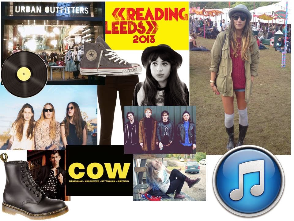
I feel my school magazine contents page is better than the front cover; this is because the layout is a lot better and you can see my house style coming through. I used the schools logo as the background, thus carrying on the brand identity of the school, as well as the school colours of red, black and white. The idea of a consistent house style and brand identity helped me in the creation of my music magazine, when I used the same three colours of peach, blue and white, and the same font through each design. I also created several moodboards to help visually represent my target audience. After I created my school magazine, I started the research into music magazines. When starting this I learnt about the brand identity of a product, which is what you see that you associate with the magazine or product, so if you see the Masthead, you will recognise it and know it belongs to that specific brand. I then created a questionnaire to find my target audience. When doing this I learnt about the JICNAR Scale and whether a person would be in the ABC1 part or C2DE.When I gathered all of my results, I presented my results in graphs and charts so show my results more clearly.
http://edenparke.blogspot.co.uk/2013/12/questionnaire-analysis.html
In conclusion I feel that I have learnt a lot from the preliminary activity, and without it, I know my final products would not have been as successful or developed.
 2)
2)  3)
3)