Tuesday, 11 February 2014
Monday, 10 February 2014
Monday, 3 February 2014
Contents Page Ideas
Things I could include in my contents page:
>Competitions
>Images of artists ( article related ) ( The largest image needs to be linked to the headline )
>Upcoming tours/Festivals
>Letter from the editor
>New Albums
>Reviews - Albums, Bands, Concerts
>Band Review
>Band Merch
>Upcoming artists
>Fashion - What the artist wore, and where you can buy it.
Representations Of My Magazine.
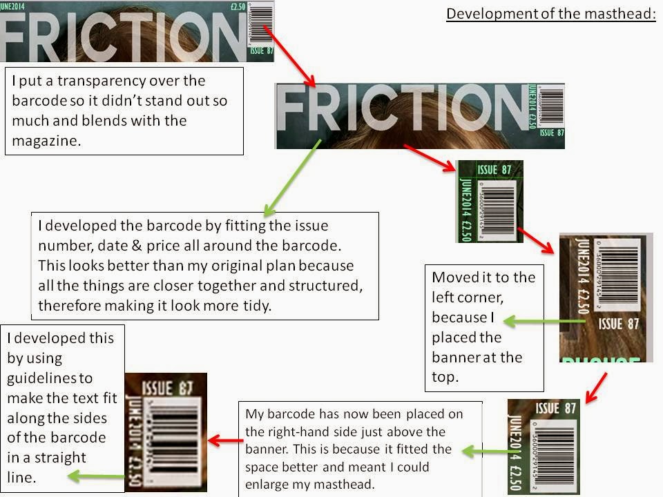
The representations of my magazine:
I am making a magazine that will represent the genre: alternative / Indie rock. With this information I will make sure my magazine focuses on artists who are not only well known, but up coming artists who aren't at the height of their fame yet i.e Haim
My target audience will be15-24 year olds. This is because the information I received from my questionnaire showed that the large majority of music magazine readers are within that age group and in addition will be in the C2DE part of the JICNAR scale, so I will make my make my magazine reasonably priced at £2.50. Also, because my target audience is 15-24 year old, I will have to make sure my magazine is current to keep my audiences interests.
I'm going to attempt to aim my magazine more towards females.
My audience should enjoy going to gigs, and going to festivals i/e reading, they should also be readers of the magazine NME, because NME publish things similar to what I want to what I want my magazine.
Q Contents Page Analysis
These are examples of Q magazine's contents pages. They all have clear structure to their designs. Each consist of an obvious theme / house style; The red banner along the top, featuring the masthead, and the title 'Contents', each have a structured area for where the features are, varying from left to right.
They all have pictures, whether they are small or large, with a page number boldly visible. And each picture which is the largest on the page relates to the main headline of the magazine.
From this I can take inspiration for my own contents pages. I can take into consideration: The structured layout and the idea of having the largest image linked to my headline.
CONTENTS PAGE LAYOUT ( MUSIC MAGAZINE )
These are my contents page layout ideas. They have a range of different designs, with one on a double page spread, however they are mostly over one page, because conventionally contents pages are on one page. I will create a contents page similar to the single ones I have designed, but I will experiment with the double paged one.
My designs have the conventional banner at the top of the page with the masthead, issue number and date in, a structured layout for my features, and two or three places for images to go. There are several where the images are the main focus, rather than the writing. -That is taking inspiration from NME's contents page layout.
I have also created an unconventional design where there is one central image as the background, and writing on top of it. I think this would be a good contents page to follow through, although it is a basic design, I would have to use a photo that stood out to make the page effective.
On my double paged contents page, I have decided to incorporate my first design idea ( of one large image and a single column for my features ) with a more cluttered design. This should be the most effective one to create because it has two good designs coming together, and allows you to have your main image as your headline image, with also images of things that are also featured in the article. The double page design takes concepts from NME & MOJO's contents pages.
Subscribe to:
Posts (Atom)